Monday, December 27, 2010
My students completing their drapery pastel paintings
I have three Atelier students Shannon Gilmore (top above), Shannon Blencowe, and Johanna Blair. I started working with each of them at the same time. Now they are a close knit group of young art students who have bonded with one another and support each others progress. This drapery project I have mentioned previously but now I would like to show each of the pastel paintings completed by my students.
This project was to take learning to draw drapery and make it a serious painting in pastel. I wanted to take them from the beginning to the completion of a work. They worked on UArt pastel paper that I purchased on line at Dakota Art Pastels, an art supply company out west that specialize in pastels, pastel surfaces and accessories. They pack and ship good too!
The beginning of the work stressed composition and drawing. Each art student composed individually and competently. They used brush and turpentine to move the Nupastel drawing and to blend values and soften edges. This was a long time project for them so that they had to pace themselves and learn the most that they could from each careful step in the pastel painting. They went from using Nupastels to Rembrandt to Schmincke pastels going from hard to soft.
The challenge of this project enabled them to take time to study what they were looking at, to learn each step slowly and to learn to complete a pastel painting to then photograph and frame for showing. Not all my teaching is from start to finish but this helps the student to take the entire process and see what it's conclusion should look like and to feel the accomplishment as well.
The completed pastel paintings are below and are just beautiful to look at. The values read properly, and the intensity of the pigments are glorious to see.
These are the completed pastel paintings done from top to bottom
Shannon Blencowe, Shannon Gilmore and Johanna Blair.
I am so pleased with the results , the hard work by each student and all the important things that they learned in the process. Hope you enjoy viewing each of the works.
Monday, December 20, 2010
"Figure and Reflection" pastel painting
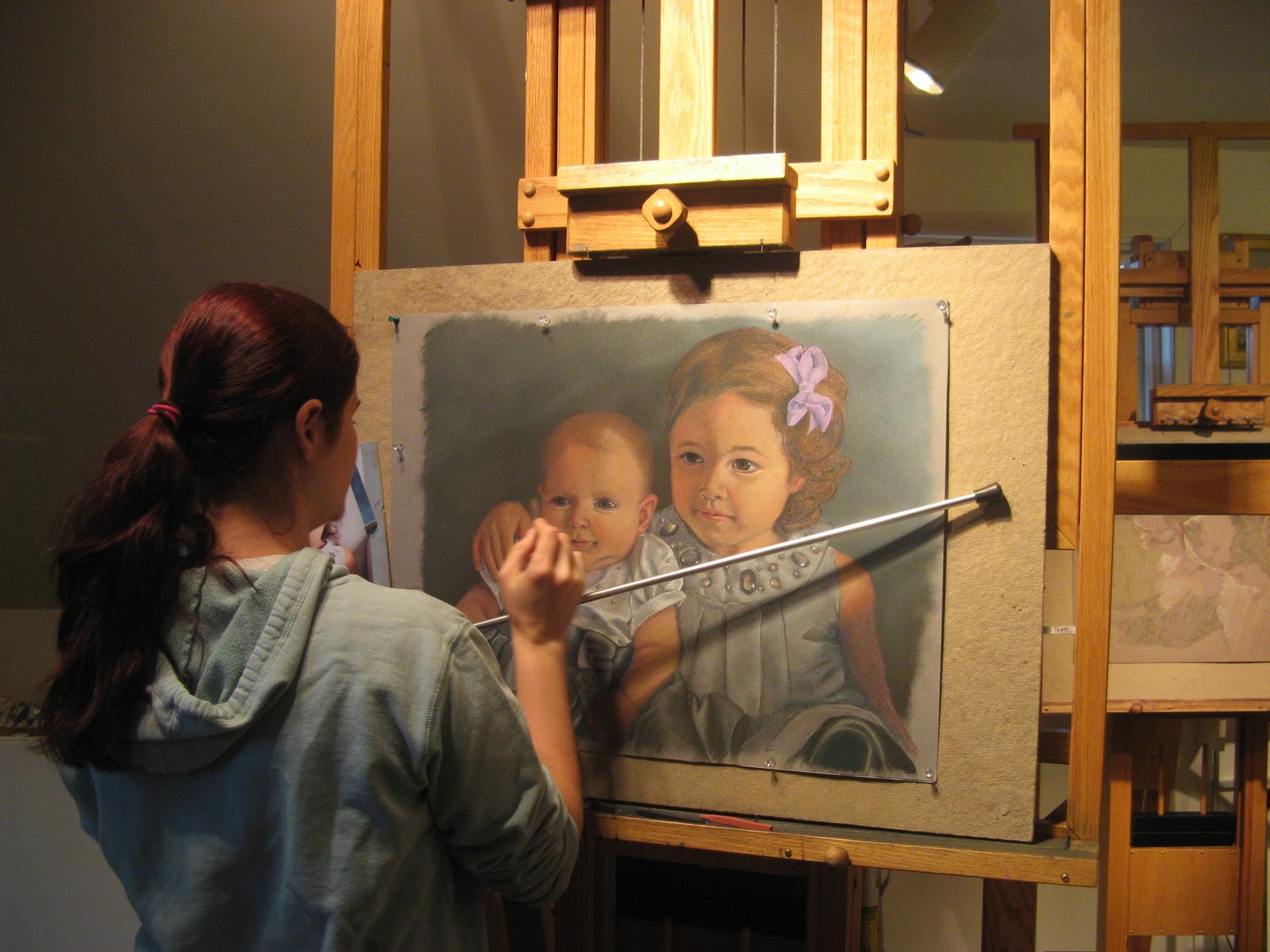
This is a recent pastel painting called "Figure and Reflection" It is 38" X 48" in size and was created on a very large handmade archival paper called PASTEL DELUXE (doesn't that say it all?) I purchased the surface at New York Central Art Supplies in NYC at the Paper Room upstairs in the store. Anyone who loves to work on handmade paper should know about this wonderful place. It is special. You can look at papers of all kinds, for all purposes all hanging on large racks just like you were looking at large rugs. Papers for watercolor, for pastel, for drawing, for printmaking etc etc. You can also find handmade papers in binders or books to work on. One time years ago, I bought a 40" x 60" size of 1800 lb. watercolor paper to do a large epic pastel on. It was so thick and was like material. Can you imagine? It was very sturdy and workable.
"Figure and Reflection" was drawn and painted on Pastel Deluxe and was created in stages. The entire work was done from life (that means from a model in front of me) and took several days to do. The model was my eldest granddaughter who had always wanted to model for a figure painting but wanted to be sure of having a certain amount of modesty. So as a result you can actually see more of a woman in a bikini at the beach than what is revealed in this painting.
I began my drawing with my nupastels, sharpened to a point and started estimating the proportions of the figure as well as the mirrors and her reflection inside of them. I used a light touch as I studied her and the elements around her. I designed a composition pleasing to me and one in which the viewer would be tempted to enter into. On the right side in the blurred reflection of my artist/friend Diane Aeschliman and on the left side is another male artist in the studio painting the model.
As I got more sure of the areas and shapes within my painting and achieved the drawing and negative spaces around my drawing to my liking, I began to put in the shadows of my forms and the cast shadows from those forms. I also find that totally interesting. It is an exciting part of my drawing for me. I continuously compare line to line, angle to angle , shape to shape and use my pastel to create a plum line to make comparisons as I draw. The more an artist makes those comparisons and judgements about what they see, the more they exercise the right side of the brain. That is the side of the brain an artist naturally uses. You can exercise the use of the right side of your brain by constantly practicing drawing.
I then use darker and darker sharpened nupastels and also change for cool to warm and warm to cool as I become confident and more accurate in my likeness. In the areas that are in shadow, I chose to use a wash of turpentine with a brush to fill in the tooth of my paper and make the areas more solid. With such a large work it helped a great deal to do this. At times I put in a thin medical glove to carefully move the pastel around with my fingers. I used girault pastels ( softer than my nupastels) and then used my sennelier set of (526) pastels that I consider my main set. I also used some darks from Terry Ludwig to increase the depth of my darks and went back and forth to be sure of having darks, middle tones, and lights in each form.
Each day the model posed, her position changed somewhat and so did the fabric that was draped around her . The objects and elements also changed somewhat as well as the temperature of the morning light and the afternoon light in the studio. Morning it was cool and afternoon was warm. The challenges before me with each painting are what excites me . I see it, I feel it and I jump into it with my skill and experience and fall in love. Yes, it is a state of being and I am in it when I paint. I am in another realm and it is passionate and sensitive and it is me.
I sprayed my work in between the layers of pastel only to darken the values and roughen the texture so that I could put on more layers of my pigment and my drawing would become more painterly . It is a fine line from drawing to painting in pastel. You just know it when you cross that line and all of the values, hues, warms and cools, darks, middle tones and lights begin to sing and the composition is enhanced by all of those choices you have made.
This painting was framed by my framer. Yes, I said my framer because that is the way I feel about the framer who selects the final surrounding for my art work and sets it apart from all else. I trust my framer's choices and decisions for enhancing my paintings and he knows my style, my palette and my way of expressing myself. I might as well give him a plug as he is Joel from Essex House of Framing in Centerbrook, CT
The final step in painting is to frame the work tastefully, artistically and for the enhancement of that work. Not to match a sofa or drapes. Pastels must be archival framed and have a spacer or a distance between the glass and the pastel. Matting and spacers are important. I introduce all of my students who work in pastel or on paper to Joel . He is reliable and professional and that is what I need.
Before I go to the framer, My work goes to Caryn Davis Photography in Chester, CT (my town)and she professionally photographs each of my completed works in high resolution and a jpeg format as well. She sends me on my way with a disc with my two images on them and I download on my computer into a file for use and I file the disc into a folder also.
The image can be used for juried exhibitions, publicity, postcards, giclees, etc. etc. I also use any photos of me next to my work for publicity, news releases, and guess what ..... my blog! In this photo you can see just how large this pastel actually is.
"Figure and Reflection" is currently on display at Maple and Main Fine Art Gallery in Chester, CT.
Hope you enjoyed learning about this painting in pastel
Wednesday, December 15, 2010
Working today with students
Today my student Johanna was coming to a finish on her double portrait of two little girls in pastel. Working on Canson paper she made sure her drawing was carefully studied to be sure of getting a good likeness of her little models. Johanna had to work from a photo in this case as her models are too young to sit for the time it would take to fully develop her pastel painting. She is using a mahl stick to steady her hand as she puts on the final touches and gets ready to sign it..
Johanna has been studying with me for around 5 months and is currently in an Atelier program of study with me. She has committed to study for a year at a time working in my studio along with a few other gifted students. They are working full days from 9am until 4 pm and concentrate on academic drawing, pastel as well as oils and they paint various subject matter. The camaraderie that the students have with one another is exciting. They bond that they have with one another is because they share their thoughts, feelings, their passions and creativity. I share the experiences I have had being an artist for over 45 yrs.as well as my philosophy of art. My students are taught that you actually live the life of an artist, it is not just a job. It is a way of life and seeing the world around you.
This is my student Shannon G. and she is in the process of drawing a portrait using nupastels, a hard version of pastel pigment. She is carefully observing her subject to achieve a good likeness and is working from dark to light at this stage and planning for her careful build up of colors (both warm and cool) with softer pigment.
Shannon is a good draftsman and so far has a passion for drawing and painting people but has finished some great still life paintings as well. I give my students extra work to do on their own, reading to do and art exhibitions, galleries and museums to visit and write comments about. I want them to be able to verbalize their opinions clearly and concisely. It is important for me to expose them to as much art as possible either in our history or being created currently.
I have booked an art exhibition in a gallery for next October 2011 so that my students can actually plan for the work that they create to be shown in a public venue. I will take them through the entire process of designing an invitation, writing their news releases, social networking for themselves, photographing and framing their completed works, hanging their show, putting our refreshments and greeting their invited guests! Then of course it is then selling their own work!!
It is an opportunity for students to really understand the life of a fine artist.
I will be relocating my atelier students down to an art studio I am involved with at the Maple and Main Gallery of Fine Art in Chester,CT. where I live. I am working to make the studio feel as comfortable as my home studio. In January, this small group of gifted artists will be working there.
I will also be starting another group of students on Tues. afternoons for a 4 hr. class that will last 6 weeks. In this class, I will emphasize drawing and pastel the medium. I will demonstrate various ways the medium can be used and how a different pastel surface can dictate to the artist just what technique is the best to use. If anyone is interested, please check out the website:www.mapleandmain.com or www.claudiapost.com
Dec.10, last Friday was the opening of the Holiday Exhibition at the Lyme Art Association in Old Lyme, CT. One of the paintings I had juried into the show was my "Portrait of Lauren" and her mom Cheryl Tyrell was there to view her daughter's portrait. Cheryl is one of Lauren's greatest supporters and has been a strong influence in her daughter's choice of profession.
"Portrait of Lauren", my student and her mom Cheryl Tyrell of Clinton,CT
Monday, December 13, 2010
My Pastel Portrait of Lauren, my student
Today I am going to discuss my pastel painting of "Portrait of Lauren, my student"
This pastel portrait was inspired by a young girl that I mentored for 2 yrs. until she went off to Boston this past Sept to the Boston College of Fine Arts with some great scholarships, awards and acheivements, along with two other fine young artists I mentored along with Lauren. She first came to me with colored pencil drawings that were a bit gothic and depicting wolves and other wild animals. As I began to teach her and share with her over the years, her drawing ablity just sky rocketed, her handling of pastel and oil was solid and professional looking, and of course she won my heart as did each of my mentoring students.
Lauren liked to streak her hair red tones and as a red head myself, I wanted to paint her with this intense red color in her hair and her light romantic blue eyes and a soft quietness in her appearance.
I chose to use a warm gray (felt gray) canson paper (archival) and used the smooth side of the paper. Contrary to what our minds would tell us, this is the side that will allow you to build up the pastel the best and hold it on. The other side of the paper has an opened texture to it and will repel the pigment instead of allowing it to build up. I immediately used my nupastels in my drawing of Lauren in controlled system I use by started with a brown shade darker than the value of the paper and step by step I make my drawing darker and darker as I study my subject and get my likeness of her exact. I believe the eyes in a portrait are the most important to capture as I believe it captures the life of the person. I think when you look into someone's eyes you are looking into their soul, their spirit. So I take great care in studying that feature. After my drawing is complete, I begin to lay in my darks, just as I would with oil painting. I am working fat over lean also as I begin to use some softer pastels or pigments as I progress in my work. I work with Nupastels, then girault, perhaps some Schmicke pastels and then to my Sennelier set of 525 individual colors and values. It is my most important set the way in which I choose to work. In this portrait I chose to use some Terry Ludwig darks to step down my values in this painting so that the dark red hair, purples in the garments and greens in the back ground could set the tone for the intense half tones and beautiful lights that are full of color as well.
I let go o f the detail I am known for and just softened my edges and brought more focus to her eyes.
This painting is special to me, has been exhibited and won awards in juried exhibitions and is currently on display at the Holiday Exhibition at the Lyme Art Association in Old Lyme, CT until Jan. 8, 2011.
This is Lauren and me last summer helping me with an exhibit of work and showing some work herself at an arts festival in my town of Chester, CT.
Saturday, December 11, 2010
Pastel the Medium Lecture Dec. 9, 2010
Maple and Main Gallery of Fine Art in Chester, CT was the background and home for my Pastel the Medium Lecture last Thursday evening. I brought with me many of my sets of pastels to show the viewers and interested visitors. I first showed my main set of 96 Nupastels which are my hard set and can be sharpened with a razor blade and further pointed with a sand pad so that I can use them as my drawing tool (or to be used like I would a small sized detail brush). This set I have used for 55 yrs. believe it or not! Yes I was 10 yrs old when I first started using pastel and have love this pigment to draw and paint with all of my life. They are numbered instead of being labeled with a pigment name (which has always made me feel that they are misunderstood!) Pastels are pigments! It is those pigments that are used to make Oil paints, Acrylics, Watercolors etc. The nupastels are pressed by machine and tragacinth glue is used to bind the pigments together. They are the set that I draw with and also use with various techniques to bring it to the point of calling it a pastel painting. I loved talking about my love and knowledge of this medium and watching the faces of my crowd when I see the light go on in their minds to actually understand and be stimulated by my sharing and experience.
I have to laugh at myself when I look at this photo as it does show my love of this tried and true set I have used for over so many years. I do not use pastel pencils because they are too hard and are a bit too glossy for building up layers of pastel in my work. By the way I think pastel is the wrong word to use for this media. I think it should be called "Pure Pigment Painting" That is truly what it is. Over all of these years of working with the medium, pastels have gone through and are still going through a true Renaissance and the large varieties of pastel, surfaces, and techniques are just amazing. So when you can have the great dark values and intensities and delicate hues, how can one still call the medium PASTEL? It is a full range of color and is true pigment painting!
I brought with me to the demo/lecture a current pastel I am working on to illustrate to the audience the beginning stage of a work I am painting on Canson Paper, which has been around a very long time and is archival. Archival means that it is 100% rag content or it is not going to yellow, fad and break down with time like your thin newspapers would do. An artist is taught to draw, paint and sculpt in materials that are going to last longer than the artist themselves and to work in a technique or process that will guarantee that as well. That is a purist people. That is putting your work before the quick buck as my late father would say.
The beginning of this pet portrait is completely drawn it with nupastels and my likeness of each dog is achieved even at this stage. As a portrait artist I find this very important and comfortable.
I will keep you all posted on the steps of this pet portrait as I think you will find it interesting.
By the way these pet models are my dogs. On the left is Angus our Bernese Mt. Dog rescue from BARC on line and on the right is Max, our Berner/border collie mix from Petfinders on line. They are characters and so loved by me and my husband. It will be a great pet portrait sample as well as a very important gift to my hubby and cherished memory for us to have, as portraits always are.
Hope I taught you something today as I share my experience and knowledge
Wednesday, December 8, 2010
Claudia Post Fine Art
This is a project that my gifted students are working on composing drapery into interesting shapes on a 3 x 6 foot pressed board. Three of them brought in a great variety of fabrics, some metallic, some velvet, some lace, some glittery, some sheer and they all were part of the arrangement of these fabrics to make an interesting composition. The we used a spot light to illuminate the set up. Then they cropped and composed again and began a drawing with sharpened nu pastels on U Art Paper. It was a new surface for each of them and a new idea for learning to do an academic drawing of drapery. They loved it and it was exciting to see their works progress with each step. At one point their work looked abstract in composition but using good drawing draftsmanship . I then had them use a wash of Turpentine to fill in the shadow parts of their drawings and then a build up of color from dark to light. I will get more photos for you to see. The student in my photo is Shannan Blencowe , the daughter of a fine artist and friend Jan Blencowe. Shannon is only 16 yrs. and will have a very professional portfolio to show when applying to college next year.
This is my student Shannon Gilmore working on her set up
This is Shannon Gilmore's completed pastel painting (photographed by Caryn Davis Photography) I think it was a great exercise for the students and an amazing result as well. It took at least four to 6 full days to complete for each student but the amount they learned in drawing, drapery and folds, using a new pastel surface, building up color with pure pigment and in great composition was just wonderful.
Tuesday, December 7, 2010
The Maple & Main Holiday Exhibit

As part owner of Maple & Main I'm delighted to report that we had a wonderful full house with over 300 guests and we sold 4 pieces of art including my own pastel, Good Harbor Beach

My lastest piece Figure with Reflections, 38x48, pastel is also in the Maple and Main Holiday Exhibit

Along with....

Still Life with Silk Cloth, oil, 20x24

The Western Wall, Jerusalem, pastel

Peppers on Emerald, oil
If you're in the area please be sure to stop in and see the show or visit the Maple & Main Website.;
Labels:
art,
artist,
chester,
claudia post,
connecticut,
ct,
exhibit,
figure,
gallery,
maple and main,
oil,
painitng,
pastel,
portrait
Subscribe to:
Posts (Atom)